Movies based on comic books are all the rage right now, and an increasing number of adaptations follow their source material very closely. While in the past comic book movies tended to downplay their roots, today’s comics-inspired flicks typically wear their influences on their sleeve. I’m not just talking about replicating plot or visual elements from the comics, either – in some cases, filmmakers even recreate actual comic book panels themselves! Below, I’ve rounded up 10 of the best examples of these page-to-screen translations; use the slider on each image to judge for yourself how closely each shot comes to its comics counterpart.
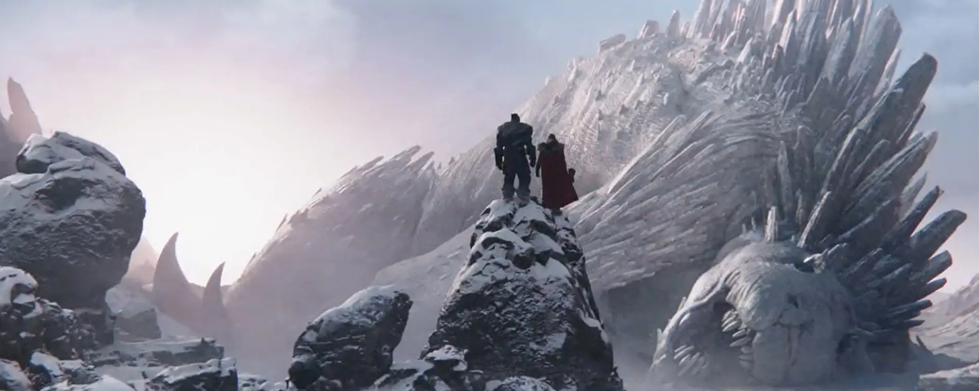
10. Thor discovers the corpse of Falligar the Behemoth (Thor: Love and Thunder)


Predictably, the new trailer for Thor: Love and Thunder made waves – partly because it teases one of the best ever live-action emulations of a comic book panel. The shot in question shows Thor and his buddy Korg atop a snow-capped mountain, looking out at the gigantic corpse of the aptly named Falligar the Behemoth.
Except for Korg’s presence, it’s a near-exact duplicate of a panel in Thor: God of Thunder #3 drawn by Esad Ribić working from a script by Jason Aaron. Everything about it, from the camera angle and creature design, right on down to the shape of the boulders in the foreground, matches up! Seriously: all that director Taika Waititi and cinematographer Barry “Baz” Idoine really changed here was the colour palette, which is more muted in the big screen version.
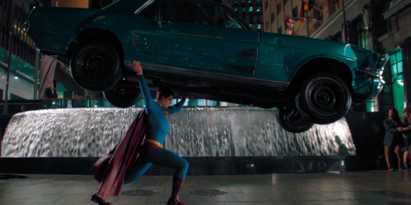
9. Superman lifts a car over his head (Superman Returns)
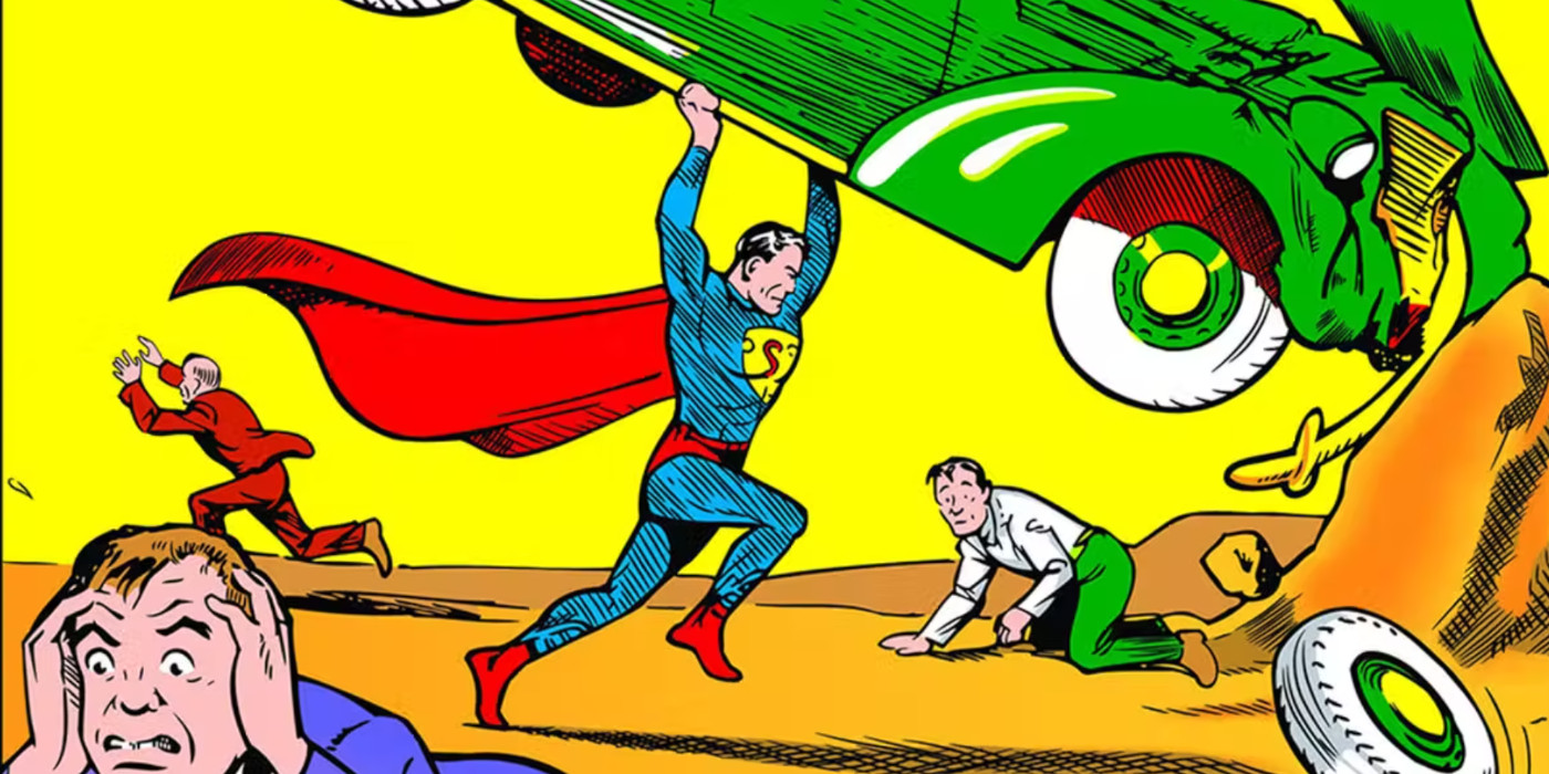
Superman hefting a car above his head is arguably the most iconic – and inarguably the most important – visual in Western comics. It’s the image that established the Man of Steel as the world’s first true superhero, and it adorned the cover of Superman’s debut in 1938’s Action Comics #1 by Jerry Siegel and Joe Shuster. Siegel and Shuster also restaged this dramatic scene inside the issue itself, where (as on the cover) Superman smashes the vehicle against a nearby rockface as a gang of hoodlums flee in terror.
Director Bryan Singer and director of photography Newton Thomas Sigel paid homage to this historic panel in 2006’s Superman Returns with a shot of Brandon Routh’s Man of Tomorrow gripping an auto overhead. There are differences; Routh gently sets down the much newer model car rather than destroying it, and there aren’t any freaked out felons on hand. Still, the resemblance between the original panel and its cinematic copy is remarkably striking.
8. The Comedian crashes through a window (Watchmen)

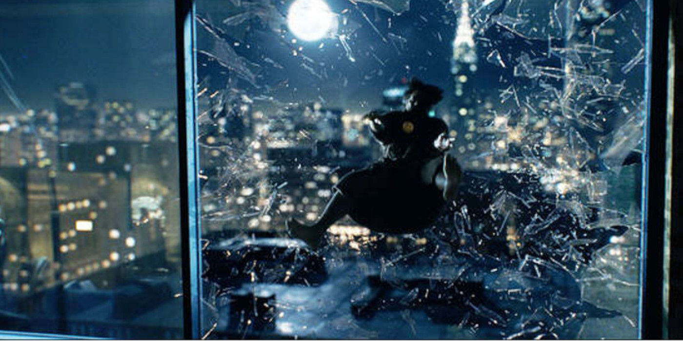
Honestly, I could’ve easily compiled this list entirely out of screengrabs from Watchmen. For better or worse, director Zack Snyder and cinematographer Larry Fong spent much of this 2009 adaptation painstakingly recreating Alan Moore and Dave Gibbons’ original panels. Faced with dozens of potential candidates, I ultimately settled on the shot in which the Comedian (played by Jeffrey Dean Morgan) crashes through his high-rise apartment window.
What made me settle on this particular page-to-screen translation, you ask? After all, there are other shots in the film that even more closely mimic Gibbons’ artwork. Here, there are several differences from the source material; the framing and angle are slightly dissimilar, and the colour palette is completely off, trading vibrant reds for cool blue tones. What’s more, actor Jeffrey Dean Morgan’s flailing limbs don’t quite line up with his comic book counterpart’s body language, either.
Yet so many of the most important details from the comic – the jagged glass shards; the city skyline; and, most of all, the bright yellow smiley face badge – are exactly as Moore and Gibbons first presented them. Because of this, the shot captures the underlying essence of the panel it’s based on, not just the visuals – and that’s got to count for something.
7. Bullseye kills Elektra (Daredevil)
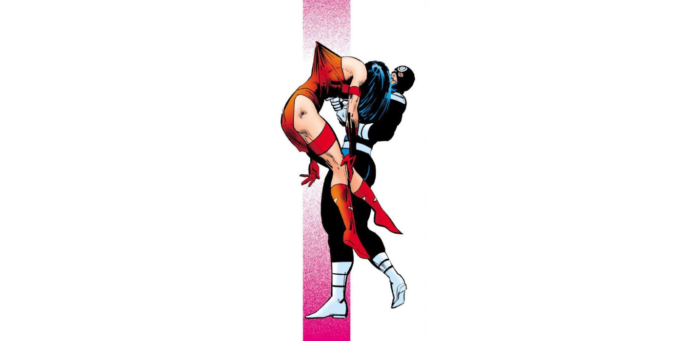

The scene where Bullseye kills Elektra in Daredevil #181 remains as brutal today as it was when the issue first hit stands back in December 1981. From the way Bullseye toys with Elektra before killing her, to the graphic depiction of the act itself – Elektra’s impaled in a very suggestive manner – this was unlike anything readers were used to seeing in superhero comics at the time.
When it came time to adapt this seminal moment in 2003’s Daredevil flick, director Mark Steven Johnson and cinematographer Ericson Core clearly took their cues from Frank Miller and Klaus Janson’s original panels. This is especially true of the shot where Bullseye stabs Elektra, which employs a similar side-on angle and recreates the stylised visual of the murder weapon pushing against (but not breaking through) the victim’s clothing.
Of course, purists will point out the minor differences. No, both characters aren’t wearing their more flamboyant comic book costumes. And no, Bullseye doesn’t hold the sai blade in a two-handed grip as he drives it through Elektra’s torso – Colin Farrell’s right hand clutches Jennifer Garner’s throat during their recreation of this grisly panel, instead. These are minor quibbles, though, and Johnson and Core do a decent job of replicating Miller and Janson’s work.
6. Michael Sullivan Jr. gazes at Chicago (Road to Perdition)


Artist Richard Piers Rayner devoted four years to bringing Max Allan Collins’ Road to Perdition script to life – and all that effort clearly paid off. Rayner’s stark, beautiful, meticulously researched pen-and-ink line work on this 1998 period crime graphic novel is among the finest artwork ever to grace the medium. Is it any wonder, then, that director Sam Mendes and director of photography Conrad L. Hall worked so hard to imbue the Road to Perdition movie’s visuals with a similar quality?
True, there aren’t many instances of Mendes and Hall directly aping Rayner’s work in the film – although one shot does subtly evoke one of the artist’s finest panels. As in the comic, when Tom Hank’s Michael Sullivan and Tyler Hoechlin’s Michael Jr. arrive in Chicago, the city’s skyline is briefly reflected on the latter’s face. Yeah, it’s not an exact copy – for that, we’d need to see Hanks’ mug in the frame too – but there’s no denying what Mendes and Hall were shooting for here.
5. Hartigan sits alone in his cell (Sin City)

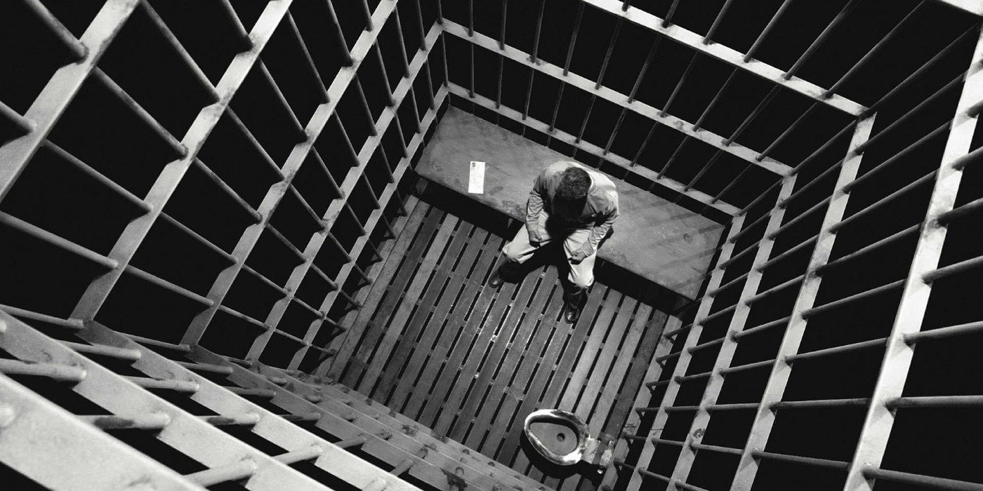
Like Watchmen, Sin City goes to great lengths to mirror the comic books that inspired it. But then, that’s virtually a given considering Sin City writer/artist Frank Miller (him again!) co-directed this 2005 adaptation!
Practically every element of the original noir comics’ trademark aesthetic – including the striking use of negative space, and the high contrast black and white palette accented with bold flashes of colour – is present and accounted for here. As such, a decent chunk of the shots cranked out by Miller and co-director (and cinematographer) Robert Rodriguez look pretty dang close to what we first saw on the page.
For a great example of this, look no further than the shot of Bruce Willis as former Detective John Hartigan sitting alone in his jail cell. The only way these visuals could be any closer to the corresponding panel in Sin City’s “That Yellow Bastard” story arc is if Miller’s actual artwork was substituted for the live-action footage. From Willis’ body language to the camera angle and quasi-silhouette effect, and all the way through to the set design, this shot is a spot-on real-life do-over of the drawing it’s based on.
4. Captain America and Iron Man both stand their ground (Captain America: Civil War)


Full disclosure: the artwork for this entry was culled from a comic book cover, not the actual interior art. That said, the design used for the covers of Marvel’s 2006 Civil War crossover series isn’t a million miles away from a standard half-page panel layout, so I’m going to bend the rules on this occasion. Besides, it’d be a real shame to disqualify such a strong page-to-screen example based solely on a technicality!
After all, Captain America: Civil War directors Russo Brothers and cinematographer Trent Opaloch did a bang-up job of matching artist Steve McNiven’s original illustration of the Cap/Iron Man showdown. Sure, the shot in the film has plenty of superficial differences to the version of this superpowered slugfest that first saw print. But the body language of both combatants – and the “irresistible force versus immovable object” spirit it represents – couldn’t be more perfect.
3. Scott Pilgrim trades blows with Matthew Patel (Scott Pilgrim vs. the World)

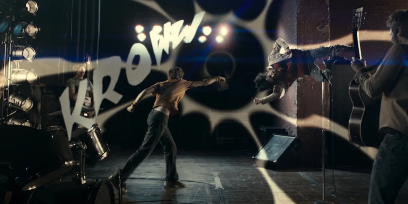
It’s virtually impossible to separate the story of Bryan Lee O’Malley’s Scott Pilgrim comics from the arresting aesthetic used to tell it – which probably explains why director Edgar Wright didn’t try to. Together with director of photography Bill Pope, Wright recreates O’Malley’s manga and retro video game-inspired visuals to dazzling effect, although, to their credit, the pair manages to evoke the vibe of the comics without delivering a panel-by-panel recreation.
Which isn’t to say that Scott Pilgrim vs. the World is entirely devoid of direct page-to-screen translations. On the contrary, live-action homages to O’Malley’s artwork are scattered throughout the film – especially during Scott’s Street Fighter-esque brawl with rival Matthew Patel. Not only do Wright and Pope mirror the angle and framing of several of the comic’s panels in this sequence, but several shots also include cartoony shockwaves and text-based sound effects, too!
2. The Joker and Harley Quinn’s mad waltz (Suicide Squad)

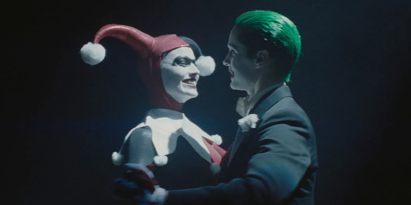
I know, I know – the subject of this entry is also pulled from a comic book cover, not an actual panel. But the overlap between Alex Ross’ stunning painting for Batman: Harley Quinn and the Harley/Joker flashbacks in 2016’s Suicide Squad was simply too good to resist. Admittedly, director David Ayer and cinematographer Roman Vasyanov lose points for failing to nail the characters’ poses as featured on the Harley Quinn cover – but that’s about the only liberties they take here.
First and foremost, Margot Robbie’s Harley and Jared Leto’s Joker both sport the exact same attire as their comic book counterparts, which is pretty neat. There’s also the darkness in which their mad waltz takes place, which has the same darkly ephemeral quality as Ross’ artwork. And hey, if that’s not enough, there’s even a shot later in the film where Harley and Joker’s body language does match up with what Ross originally rendered!
1. The death of Gwen Stacy (The Amazing Spider-Man 2)

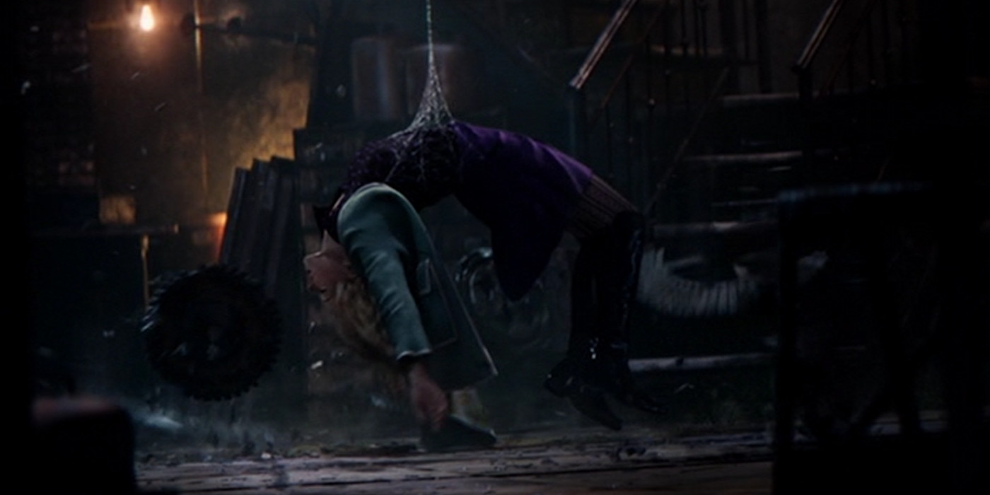
The first Spider-Man trilogy staged a scene similar to Gwen Stacy’s death in The Amazing Spider-Man #121, with Kirsten Dunst’s Mary-Jane Watson subbing in (and ultimately emerging unscathed). Director Marc Webb would later present his own, more comics-accurate take on this tragic event in 2014’s Amazing Spider-Man 2, with Emma Stone portraying the ill-fated Gwen.
Webb’s adherence to Gerry Conway and Gil Kane’s original story extends beyond the obvious, though – he and director of photography Dan Mindel also duplicate the panel depicting Gwen’s death, as well. No, we’re not looking at a meticulous recreation here, however, the similarities between the Kane’s panel and live-action shot are nevertheless unmistakable.
Not only does Stone’s outfit strongly resemble what Gwen wears in Amazing Spider-Man #121, but her body language is almost identical, too. Even the placement of Spider-Man’s webbing on Gwen’s waist is faithfully carried over for the live-action version of this scene. All in all, this is not a bad effort by Webb and Mindel.
What’s your favourite comic book panel-to-screen translation? Let me know in the comments below, or on Twitter or Facebook!
